Copied —
Component Coffee Coffee Labs — Visalia, CA
Pure signal. No noise.

Brand
guide

A hi-fidelity coffee brand built from clean parts. This guide is the reference for keeping every touchpoint tuned — logo, color, type, image, and voice. Deep bass, dark roast.

Scroll to begin
01

The Story

Component Coffee began as a rebrand built from three signals: Swiss modernism, analog technology, and nostalgia. The logo itself is drawn from the red, white and yellow component cables on the back of an old TV — the parts that make the picture.

The voice leans into music and tech — warm, precise, a little playful. The visual system leans into minimalist Swiss typography, with deliberate room to play with pattern and color. Serious about the craft, light on our feet.

02

Voice

Say the true thing, in the fewest words, without dressing it up.
(How we sound)
1
Observant

We notice the small stuff and say it plainly. Specific detail over adjectives — the varietal, the elevation, the hour of the morning.

2
Dry

Wit with a straight face. We’re funny the way a good record sleeve is funny: understated, never trying to be liked.

3
Technical, not clinical

We know the numbers and we’ll share them, but we lead with what it tastes like. Precision is a courtesy, not a flex.

4
Unhurried

Short sentences. Space to breathe. We never sound like we’re selling something in a hurry.

5
Hospitable

Personality never gets in the way of taking care of somebody. We write like a good host talks — welcoming first, clever second. Community shows up as names, regulars and open doors, not as the word “community.”

6
Tuned to the past

The name came from the guts of an old CRT, and the voice keeps that wiring. Music and analog tech are our reference shelf — borrow a lyric, a format, a piece of hardware language and bend it toward coffee.

(Rewrites)
Not this

Our expertly crafted, artisanal small-batch blend delivers an unforgettable coffee experience.

This

Washed Caturra from Huila. Tastes like plum and brown sugar. 1,750m.

Not this

We’re SO excited to announce our brand new seasonal menu — you’re going to LOVE it!

This

New menu. Six things. Two of them are cold.

Not this

Unfortunately, due to unforeseen circumstances, we will be closed today.

This

Closed today. Back at 7am tomorrow.

(Signature lines)
Play it loud.

Sleeve-note shorthand. Works on a dark roast, a busy Saturday, and a sign on the door.

No skips.

A record you play front to back. Works for the menu, works for the day.

Deep bass. Dark roast.

Two registers, same low end.

Fully synthesized.

Synth language for a blend. Separate parts, tuned until they read as one.

A hi-fi experience.

Fidelity as hospitality. Works on merch because it isn’t about coffee at all.

04

Color

Three tiers. Primary carries the brand, secondary neutrals do the quiet structural work, and a wide tertiary spectrum opens up label, icon, and pattern artwork. Click any swatch to copy its HEX.

The Constraint

Primary and neutrals carry the vast majority of the work — Ink and Paper White ground almost everything, with Signal Red and Marigold as punctuation.

Reach into the tertiary spectrum for labels, icons, and pattern — at full strength, one or two per composition, no muddy blends.

(Primary — the brand)
Black
#111111
Paper White
#FFFFFF
Signal Red
#E62817
Marigold
#F6B300
(Secondary — neutrals & greys)
Fog
#F4F4F4
Lightest / fills
Ash
#CFCFCF
Hairlines
Slate
#969696
Muted text
Graphite
#464646
Deep neutral
The Freedom

The spectrum spans warm (Salmon / Orange / Hot Pink) through cool (Cobalt / Teal / Lavender / Plum), plus an electric Neon and Silver / Gold metallic finishes for foil and print.

Rotate the pops release to release. It stays unmistakably Component because the ink, the neutrals, and the dots never move.

(Tertiary — the spectrum)
3 shades per hue · tap to copy
Crema
Light #F4EEE2
Base #E8DCC4
Deep #8E8778
Salmon
Light #FFC5B9
Base #FF8A73
Deep #9B5849
Orange
Light #FABD8F
Base #F47A1E
Deep #954E17
Sunshine
Light #FFF08E
Base #FFE01C
Deep #9B8916
Neon
Light #E3FF9E
Base #C6FF3C
Deep #7A9B29
Avocado
Light #C5C59E
Base #8A8B3C
Deep #575829
Teal
Light #96BFCB
Base #2C7E97
Deep #21515D
Cobalt
Light #92A0F0
Base #2540E0
Deep #1D2D88
Sky
Light #DCEDF5
Base #B9DBEA
Deep #72878E
Lavender
Light #E0C7F8
Base #C08FF0
Deep #775B91
Plum
Light #B7A5B1
Base #6E4A63
Deep #47323F
Hot Pink
Light #FA90CD
Base #F5219B
Deep #951B60
Blush
Light #F3DDE9
Base #E7BAD2
Deep #8D7380
Espresso
Light #A59A95
Base #4A342A
Deep #32261E
(Finishes — metallic stock)
Print / foil only
Silver
Metallic finish
Gold
Metallic finish
05

Type

Neue Haas Grotesk Display
ABCDE
fghij 0123
Space Mono
AaBbCcDdEeFfGg
0123456789&!?

Monospace carries body copy, labels, coordinates, and captions. Uppercase it for metadata; sentence case for reading. It’s the technical counterweight to the loud display face.

(Setting type — examples)
HeaderSize 120px
Leading Tight
Tracking -2%
This is a title example.
SubheaderSize 48px
Leading Tight
Tracking 0%
This is a subtitle example.
BodySize 18px
Leading Normal
Tracking 2%
This is a body copy example, lorem elit adipiscing elit, sed do eiusmod tempor incididunt ut labore et dolore magna qua aliqua. Ut enim ad minim veniam quis ex nostrud exercitation ullamco.
CaptionSize 14px
Leading Tight
Tracking 0%
This is a caption example, lorem elit adipiscing elit, sed do eiusmod tempor incididunt ut labore et dolore magna qua aliqua. Ut enim ad minim veniam quis.
MetadataSize 11px
Leading Normal
Tracking +14%
Case All caps
Section labels · navigation · eyebrows · swatch names · table of contents
06

Photography

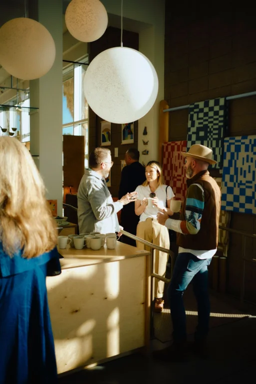
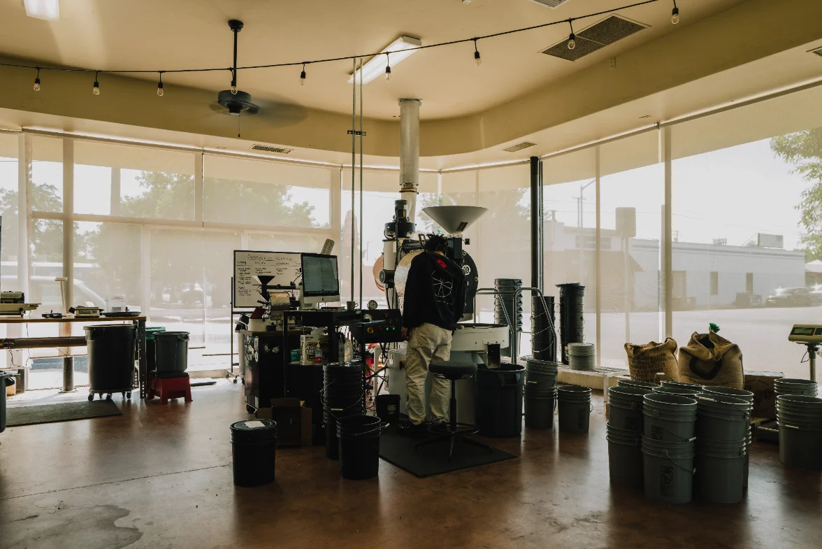
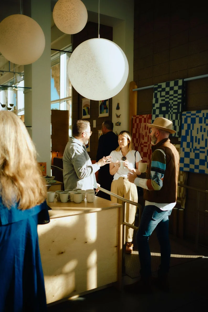
We photograph what most people walk past. Available light, expired film, and the patience to notice the thing nobody else in the room is looking at.
(The look)
Expose for the highlights

Never for the shadows. A protected highlight and a black shadow beats a balanced, flat frame. If it comes down to a silhouette or a blown-out window, take the silhouette.

One strong source

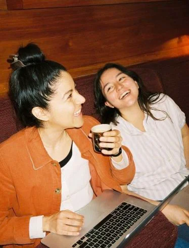
Sunrise or last light, a window, a doorway — one source and deep shadow, warm cast, hands in the frame. No flat, evenly lit scenes, no cold blue grade, no stock smiles or styling that doesn’t belong in the shop.

Film, not clean digital

Grain, halation, a little colour shift. An expired roll is on brand. The nostalgia is the point; a clinically sharp file isn’t.

Warm, human, never sterile

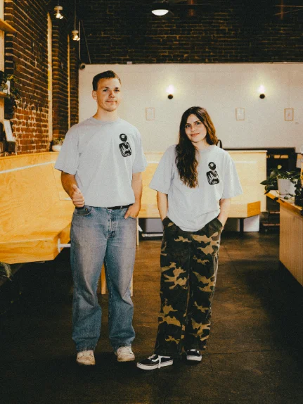
Amber, cream, wood, terracotta. Editorial when it needs to be, but it should always look like somebody was in the room. Avoid cold, evenly lit product photography.

(The moments)
01
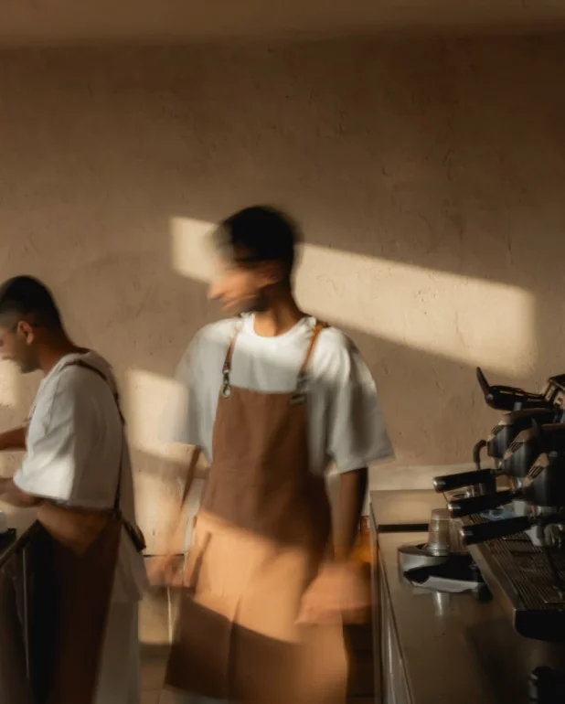
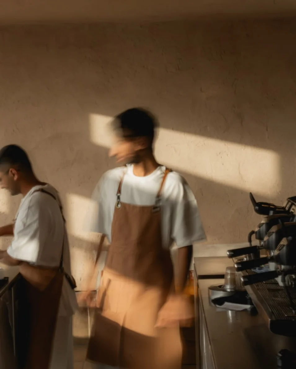
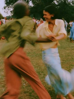
The room in motion

Drag the shutter and let the room smear — someone crossing frame, a hand mid-gesture, a queue folding around itself. The counter stays sharp, the movement doesn’t. This is the busy room read as energy, not as noise.

02
Something unusual

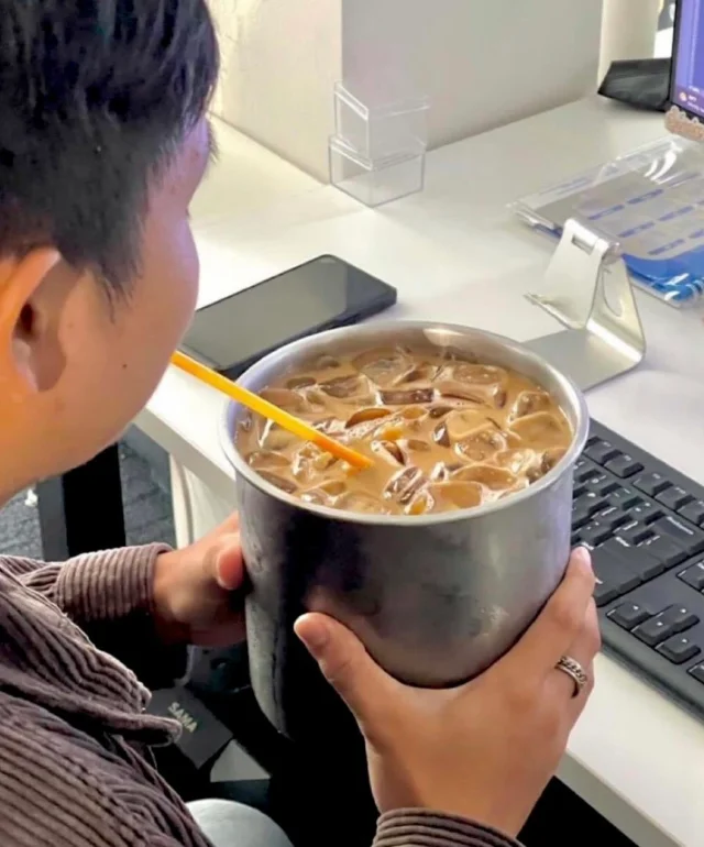
The dog in a costume. The nine-top that pushed three tables together. The birthday, the band loading in, the stranger who became a regular. Shoot it before it composes itself — whimsy only survives if you don’t direct it.

03
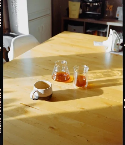
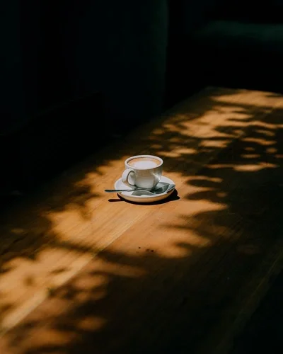
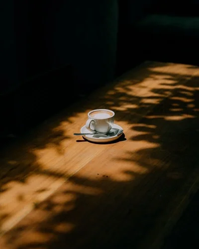
Golden hour

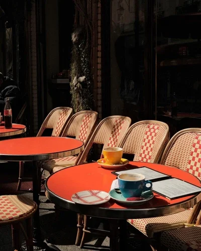
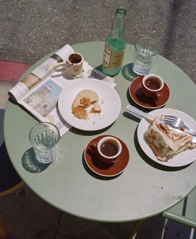
Early morning or last light. Long shadows across a table, sun raking through a window. If you can’t shoot at either end of the day, find the darkest room with the strongest single light.

04
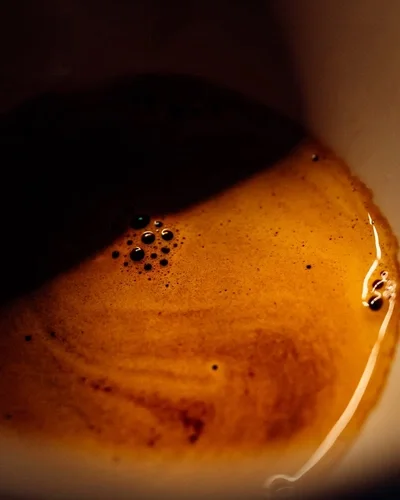
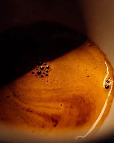
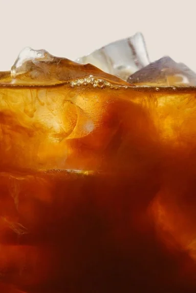
Macro study

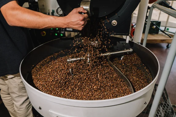
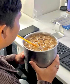
Crown of crema, a bubble, the thread of an extraction. Get close enough that the world drops away — the detail treated like science is how the careful eye shows up.

05
Dim studio

Food and drink lit low against near-black. Quieting the noise around a product is what makes it read as considered and worth wanting.

06
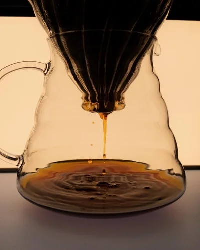
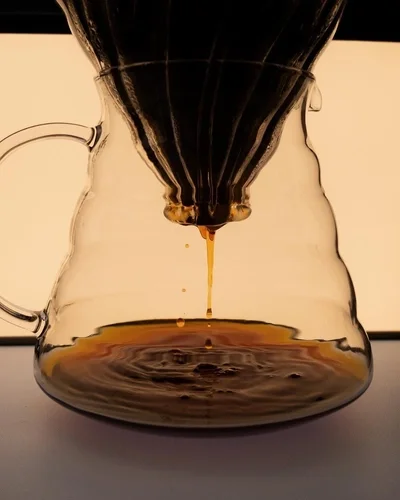
The pour

Mid-motion, mid-extraction. The stream, the drip about to fall, steam catching light. Blur is allowed; a frozen catalogue still is not.

07
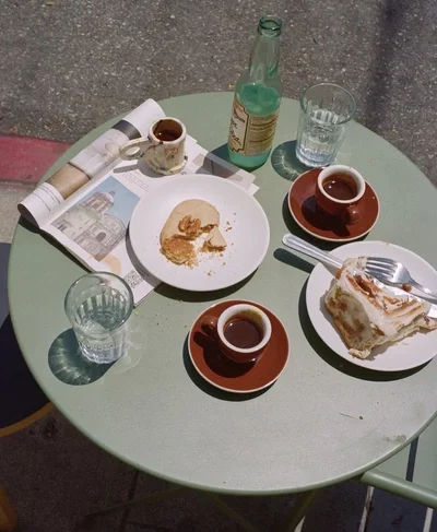
The aftermath

The drained cup, the ring on the table, the spill, the last crumbs. Enjoyed beats perfect — it’s proof somebody was actually here.

08
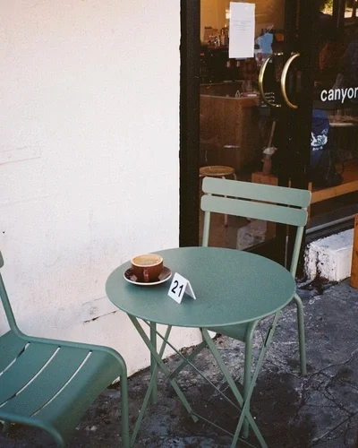
Café life

The editorial register: tables, chairs, a hand on a saucer, a shopfront in the sun. Shot loose, from a real seat, never art-directed into a lifestyle stock frame.

09
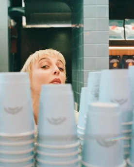
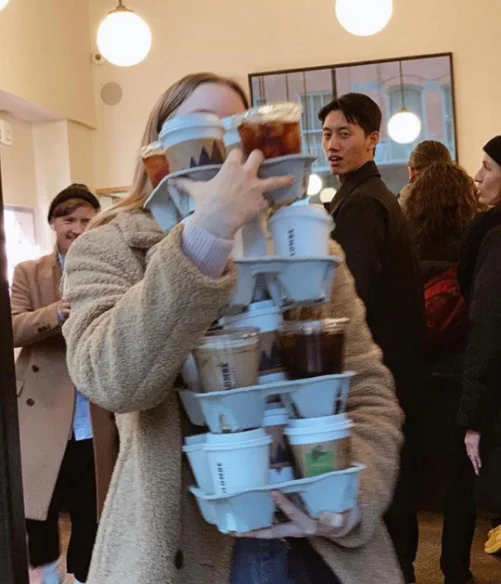
Layers of the room

Stack the room in depth: someone reading up close, a conversation behind them, the counter working in the back. Three lives in one frame, none of them aware of each other. Shoot through people and past them — the crowd is the composition, not the obstacle.


Moodboard

Drop images straight into any frame. Keep the board honest — if a reference wouldn’t survive the rules above, it doesn’t belong here.


07

Icons & Patterns

A home for the brand’s icon set and repeatable patterns as they’re built. Drop artwork into the frames below — icons stay simple and geometric; patterns tile from the dots and the tertiary spectrum.

(Brand icons)
(Brand patterns)
08

Applications

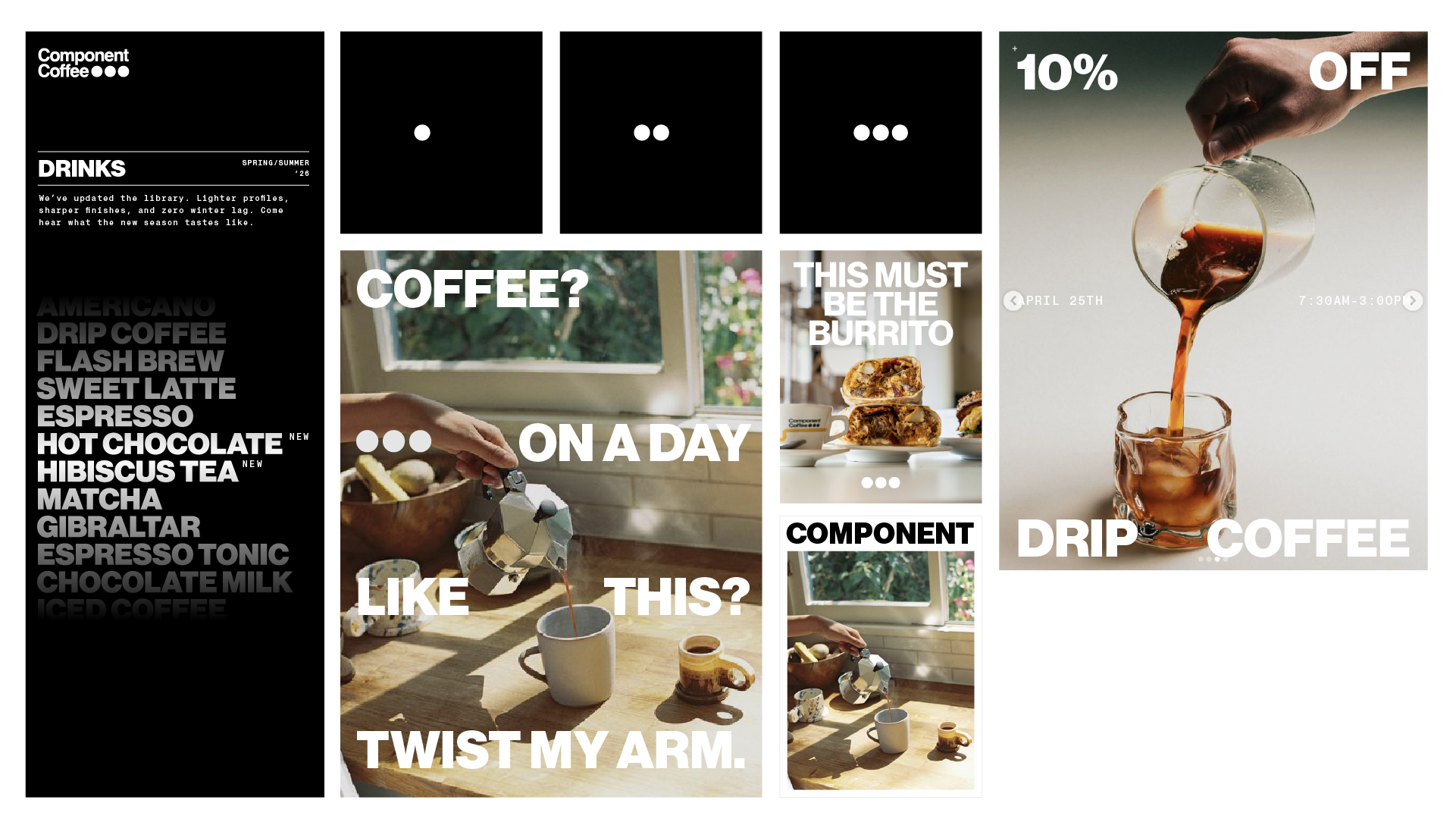
Social posts
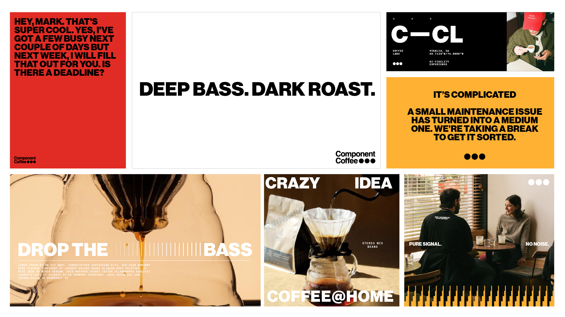
Posters and announcements
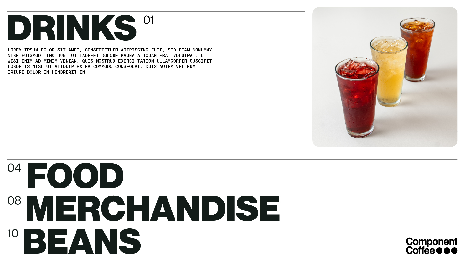
Section layout

Big type, one photo, one accent, and the dots. Whether it’s a menu, a promo, or a “we’re closed” notice — the system stays loud, warm, and unmistakably Component.

Coffee Labels
(Expansion palette in play)
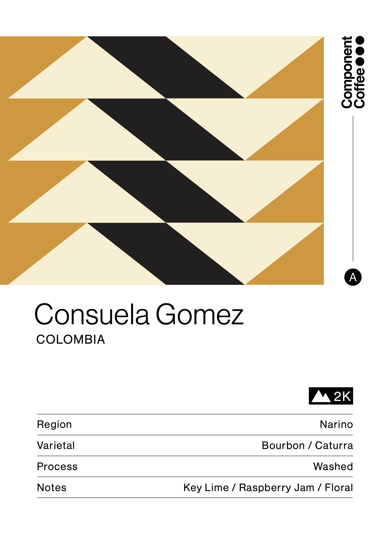
Consuela Gomez label — Colombia
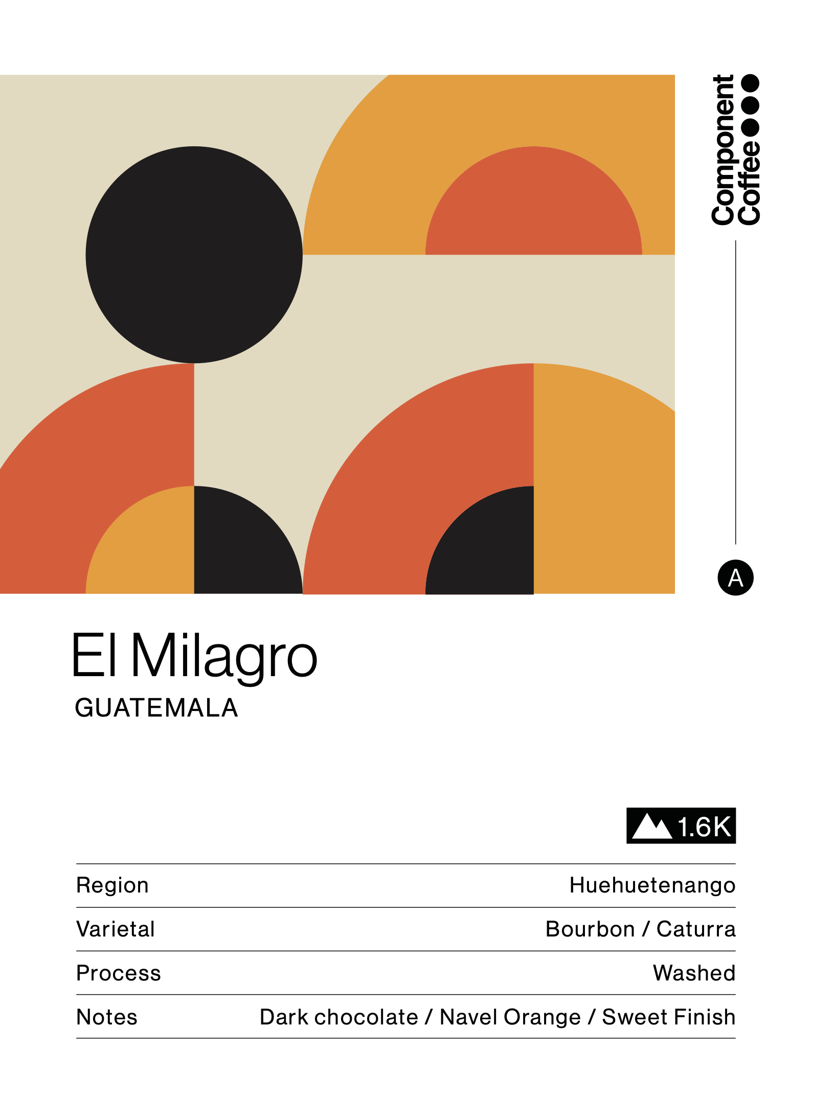
El Milagro label — Guatemala
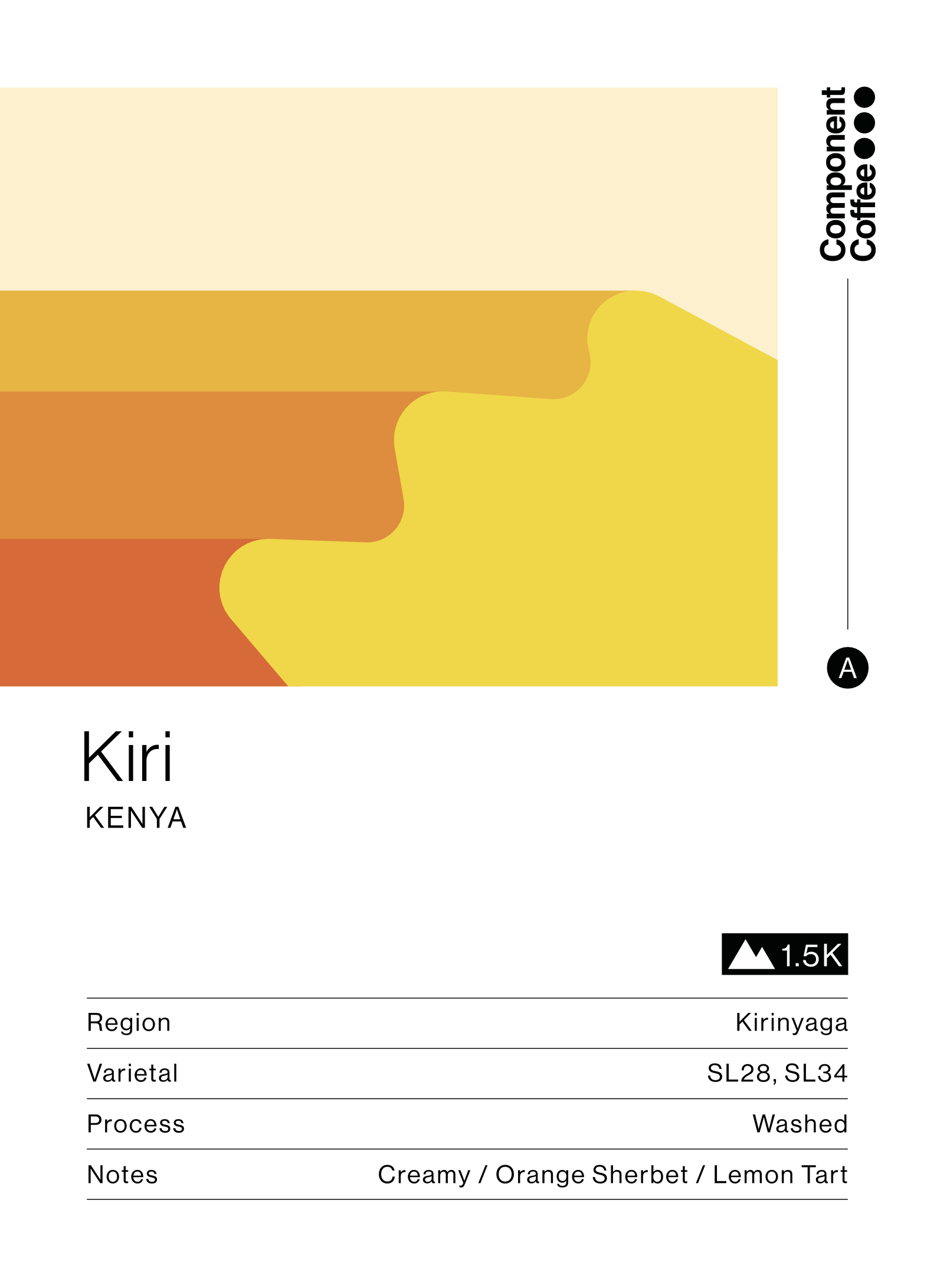
Kiri label — Kenya
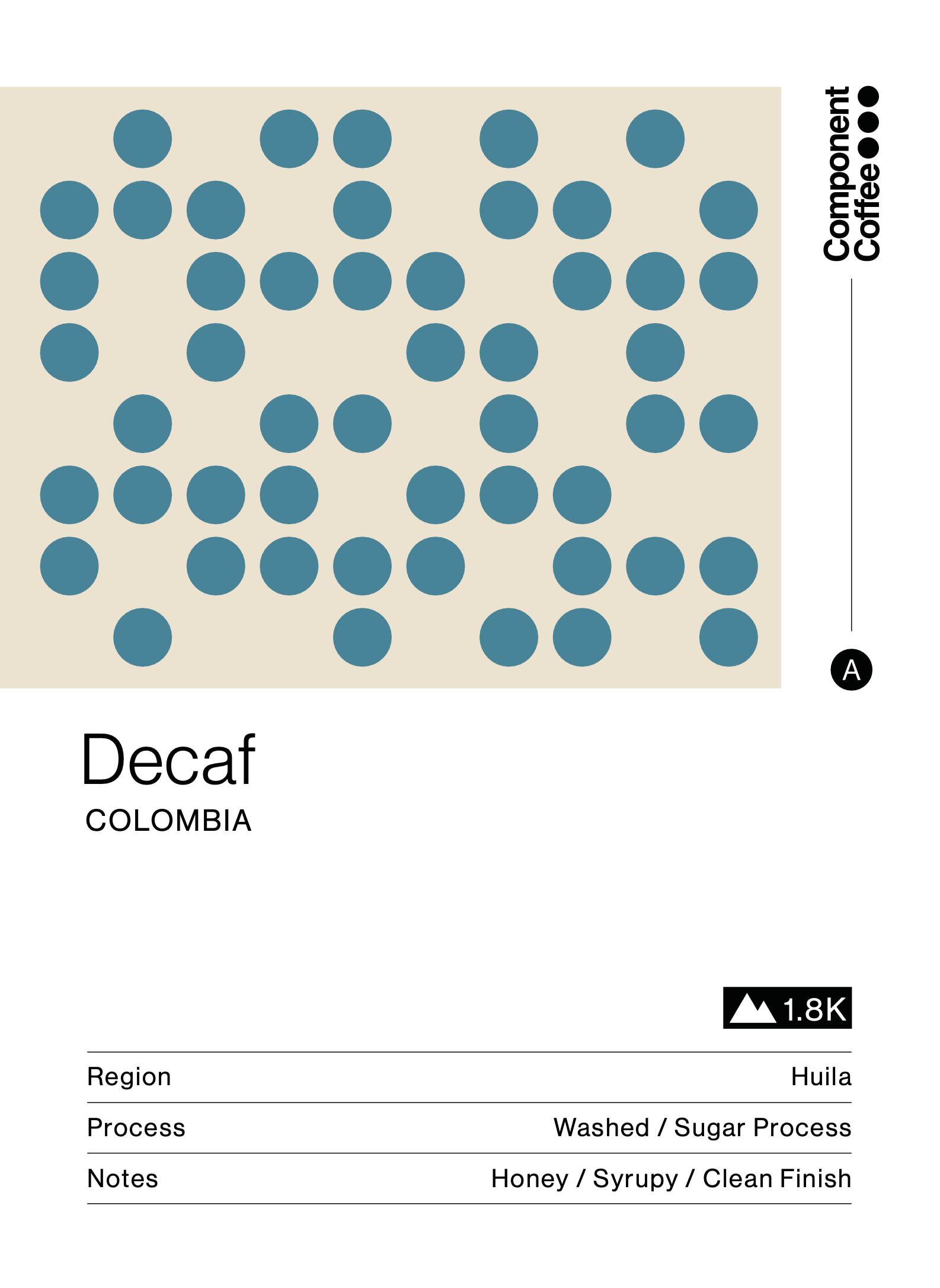
Decaf label — Colombia
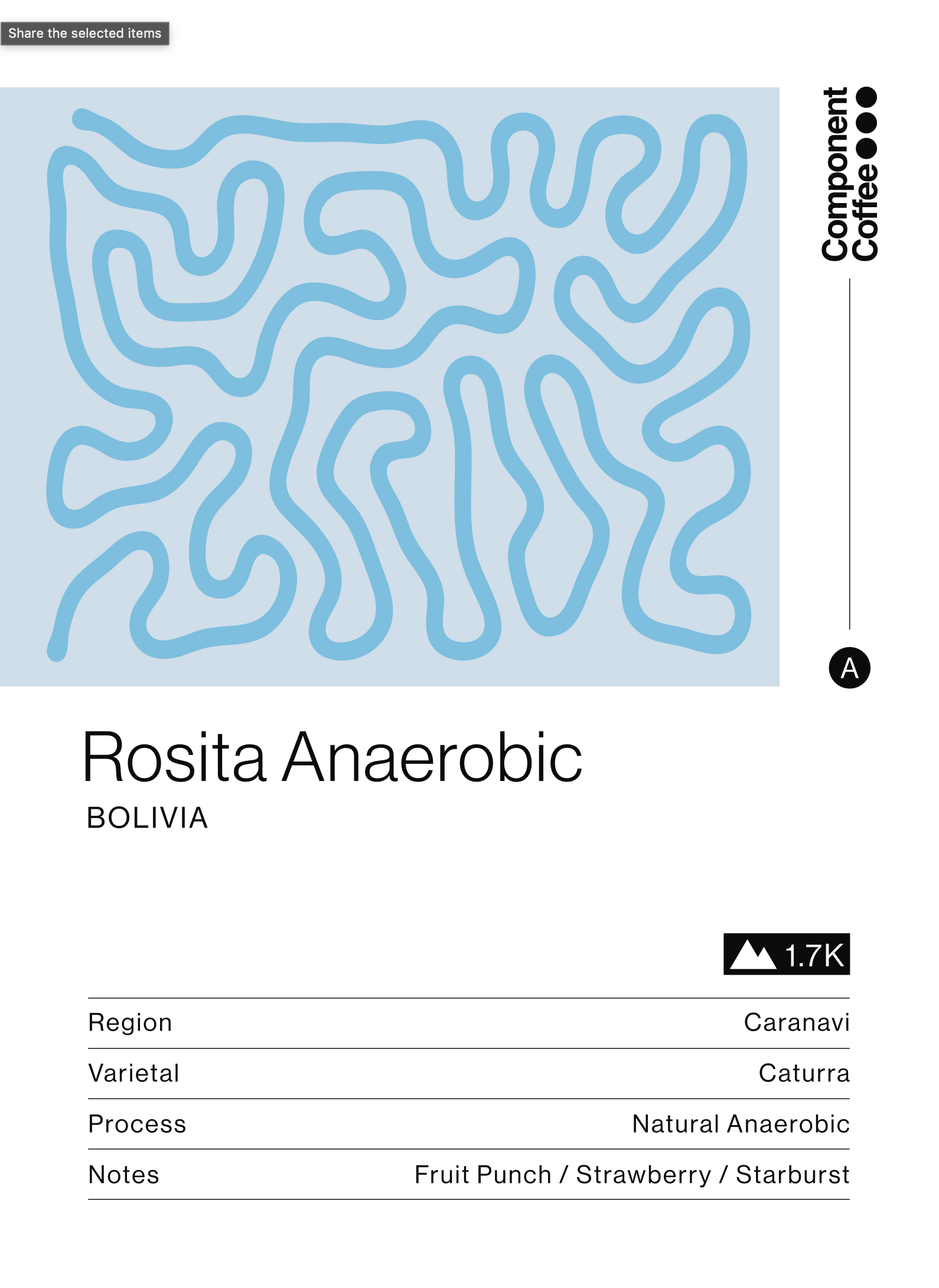
Rosita Anaerobic label — Bolivia
Component Coffee — Brand Guide V.2026
Questions? greg@componentcoffeelab.com